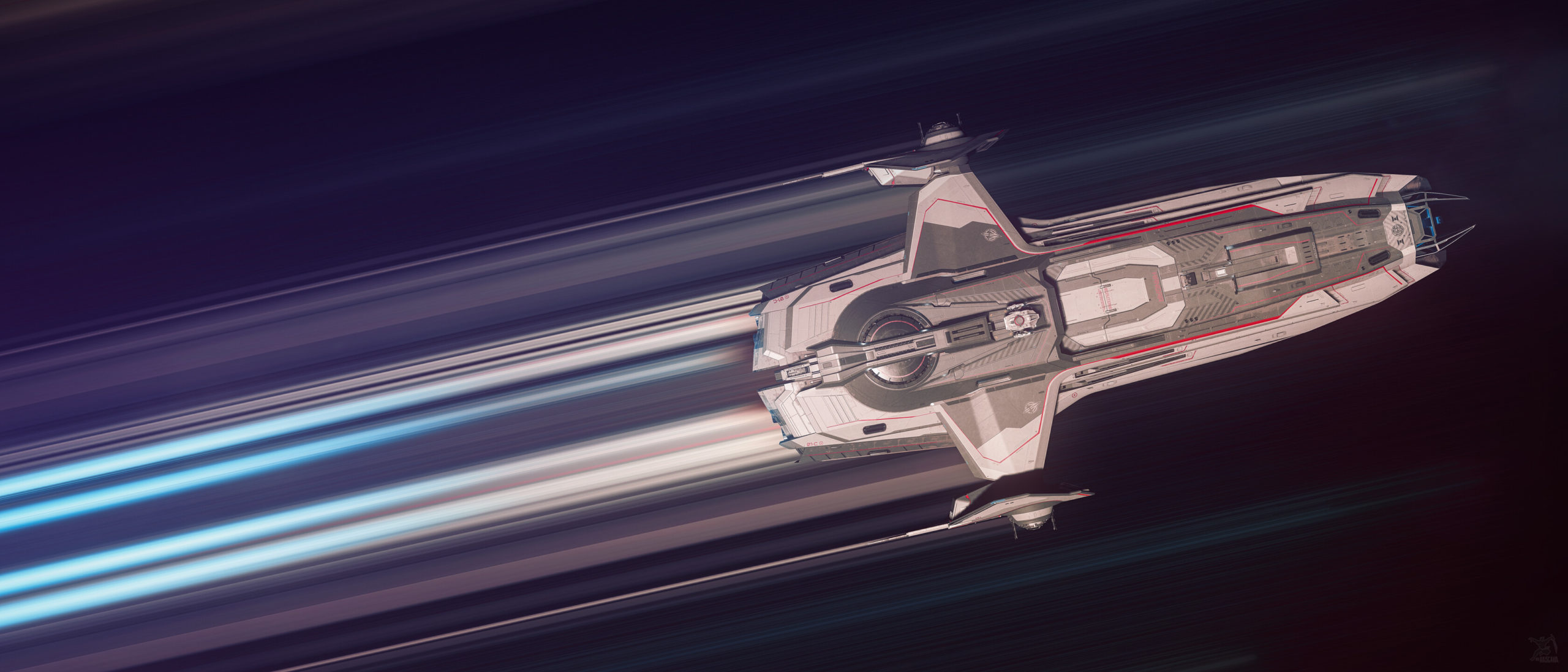
With the Star Citizen subReddit growing to over 200,000 subscribers/citizens AND the since the existing banner/background was a year old (which I had also created), I was asked to create a new image for the subReddit. I was told, “something 3.9… something microTech”.
The main complication with creating an image for use on the subreddit is that it has to work as a thin horizontal banner AND a full size image. The OLD reddit layout and styling for the sub is still accessible and MANY people still access it. That layout uses a full size 16:9 image for the ENTIRE background of the page. While the background image is most prominent in the header as a banner, the image still extends to and is visible at the bottom of the layout. But the NEW default Reddit layout uses only a thin horizontal banner across the top. Because of this, the image/design has to be focused in a thin band across the top BUT still be interesting enough throughout the image and at the bottom.
This was my previous image that had occupied the subreddit banner/background for the past year:
I started the project with a loose idea: the New Babbage skyline in the background across the “banner” area with a Carrack on a pad in the foreground (but still up in that banner area).
The first step was capturing that “background” shot, making sure the skyline was small enough and focused at the top so that it would display within the banner format. For that, I captured a huge 8k shot that I could crop and edit without worrying about significant lose of quality. Basically, 8k gave me a lot of wiggle room.
After that, I reshot the Carrack MUCH CLOSER on the pad at 4k so that I could drop that into the shot over the original Carrack used for size and placement. This would give me a much more detailed and nuanced Carrack on the pad. I used ReShade to create a greenscreen effect so that I could more easily isolate it and drop them into the scene.
While I was at it, I decided to add a shot of my character standing on the pad… but that’s barely noticeable in the final product.
Next up were the Sabres. I still created the Sabre shots on microTech to make sure I got the lighting and color similar to the base microTech scene.
Then, I took shots of the Sabre thrusters and contrails so that I could add those to each ship to give the shot a bit more movement.
You get the idea…
Eventually, I started adding in fog, clouds, smoke, and other environmental details through a mix of 3rd party images and textures and Photoshop vfx wizardry. I hope everyone enjoys it. Use the link below if you’d like the full size, full 4k resolution version.


