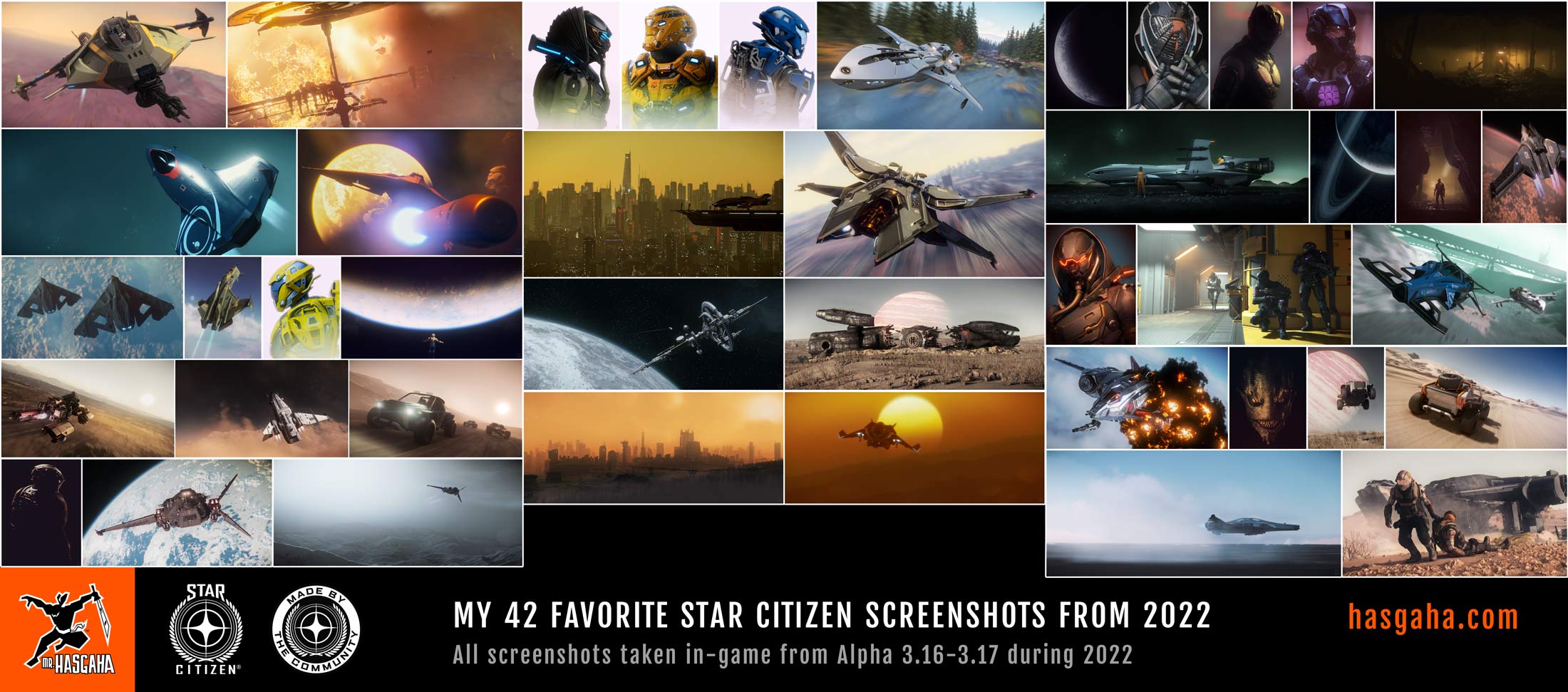
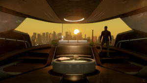
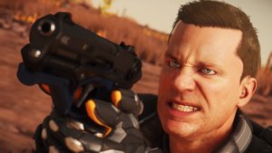
The Star Citizen subReddit held an “Arts & Crafts” contest recently. I decided to create a full size, printable, mock Star Citizen movie poster for my entry.
The Contest
The subReddit contest was divided into two categories; each category will have two winners decided by popular vote:
- SC Art: screenshot, image, painting, video, drawing, etc
- SC Crafts: 3d print, clay, macaroni collage, anything physical
Since I’m a print/digital graphic designer and have ZERO talent when it comes to three dimensional art (beyond LEGO), the ART category was my obvious choice. And since I’ve been wanting to create a mock movie poster for quite some time now, I decided this was a great excuse to finally make an attempt.
My concept was to create a cohesive and believable mock movie poster by mimicking elements and themes from actual movie posters using in-game screenshots… ALL while making everything high enough resolution to be printed as a full size, 36″x24″ movie poster. And here it is:
The Details
I spent a day or two researching predominantly science fiction and action movie poster designs like Rogue One, Blade Runner, etc. That was my crash course in movie poster design… specifically of the mainstream, blockbuster vein. If I had more time, I was going to create a second, more “designy” poster.
Even though it’s collage-esque, in order for the entire layout to be cohesive, I had to be mindful of in-game lighting, shadow, color, distance, angle, etc while capturing each image. The lighting and color greatly complicated things as it meant I had to find areas with not only great color and lighting, but places I could easily return to after switching characters. In the end, I used almost 50 individual super high resolution in-game screenshots from Star Citizen Alpha 3.5… and took three times as many in the process.
Here are some close up detail shots:
After capturing each in-game screenshot in at least 6000×3375, they were each individually and painstakingly masked to remove backgrounds, color and level tweaked to match others in their section, and touched up to remove graphical oddities… just as actual movie posters are. In some situations, I could use ReShade (a real-time, in-game post-processor) to add a Chroma Key shader to effectively greenscreen out the background. But when hair, thrusters, or other transparent-ish elements were involved, I had to manually mask out the backgrounds. And for anyone who has done any photo editing with hair involved, they know it’s a tedious process. It seems to be worse for fake, pixel hair. I’m not 100% happy with how the hair masking came out, but I ran out of time and really just wanted to move on.
Where’s Waldo
And like all great internet communities, the Star Citizen community is rich in memes, references, and inside jokes. So what would a massive graphic like this be without some hidden references. I’ve hidden or modified 12 things within the poster… can you find them all? Some are more obvious than others… and some are maybe more obscure. But I think there are 12 in there.
I need to thank my friend, Monk, for brainstorming some of these references to hide.
The title itself, “Space Be Crazy”, is a direct quote from Dave Haddock (Narrative Director) on an episode of Around the Verse from Jun 22, 2017 (35:00 timestamp). So a big thanks to Dave for that glorious quote.
Results
Since the contest was through Reddit (a website) and I wanted to print the final result, I ended up with two versions in appropriate sizes and color modes: one for the SCREEN (150ppi, RGB) and one to PRINT (300ppi, CMYK). But even still, my master print file is over 300 MB and not really appropriate for mass sharing. So, my general-purpose print file is a full size CMYK JPG for easier access. The JPG compresses the file size to a manageable state at a loss of quality. If you’re looking to print this in a high quality fashion, let me know and I will get my master print file to you.
Regardless of the results of the subReddit contest, I had a blast creating this piece and I’m incredibly proud of how it turned out. I’ve already had a test print made but I’m not happy with the quality of the print job… lots of printer lines (not color banding) and it’s VERY blue and dark. Someone else printed it at another shop on vinyl and the results were MUCH better. Once I get a print quality I’m happy with, I’ll make a small batch and give some away.
LINKS
Download the LARGE SCREEN Version(150ppi, 4800x7200px, RGB, JPG, 20 MB) Download the PRINT Version
(300ppi, 24×36″, CYMK, bleed, JPG, 64 MB) View the RSI Community Hub post subReddit Contest Rules My Contest Entry Post


